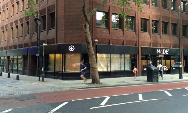
Made.com is one of the first examples of a pure-play online retailer having a go at bricks & mortar retail. Occupying the site of Blackwells – the student bookstore, the store looks fairly ordinary from the outside. As you enter the store, the first thing you notice is furniture projected onto the wall, augmented into a scene that includes real furniture.
The technology allows Made.com to change the furniture with the cost and hassle of shipping new furniture into the store. This version of augmented reality doesn’t involve any sophisticated hardware or software and gives the customer a sense of perspective – though unlike 3D augmented reality the furniture does look rather flat when projected onto a wall. As you take a glance to the side, you see a bank of Android tablets on a stand next to a sea of product pictures on a wall. It’s a call to action – you pick one from the magnet rack and start to interact with the device. Before going any further, it asks you to enter an e-mail address. That’s it – they have you tracked, your actions can now be tracked as you start to interact in the physical environment.
You immediately start tapping the device against products on the wall and the device and through the NFC tag, the app brings up the product detail page of the product that you have tapped against. You’re able to add products to a wish list and send it to yourself – it’s no more sophisticated than that. The products on the wall are also small drawers which contain postcards of the product which you can take away with you if you want a physical representation of the product.
Like with the product wall, customers can also tap any of the physical furniture items in the store to bring up the product information. The plus tags on the products contain the NFC tag. The symbolic plus tag is like your call to action. As you walk around the store you will see notices reminding you to share with your social network as you discover products that you like. As you continue your journey of intrigue, you find yourself walking towards the back of the store where a bank of smart looking Apple Mac computers are located. Customers can browse and order from these machines as they would on their home computer. There is no sophisticated touch screen kiosk here – this area is more like an internet cafe than a store..
And that ends the journey. As you walk out of the store, you notice through the glass wall, a fully occupied office. This site is also the head-office and just like Argos Labs which is located above a store in Victoria, the team who created the Made.com concept are located where they can observe how the customer interacts with the concept and continuously iterate the concept. Made.com chief Ning Li said: “Everyone is trying to find a way to link both online and physical worlds. Online, there are no square footage constraints – space is endless – so coming up with ways to showcase our full catalogue here was a challenge. “We’ve achieved this by incorporating digital elements but only in ways we feel add value and are not in any way gimmicky.”


